Digital Platform

Tech recruitment with heart
AGILE SEARCH

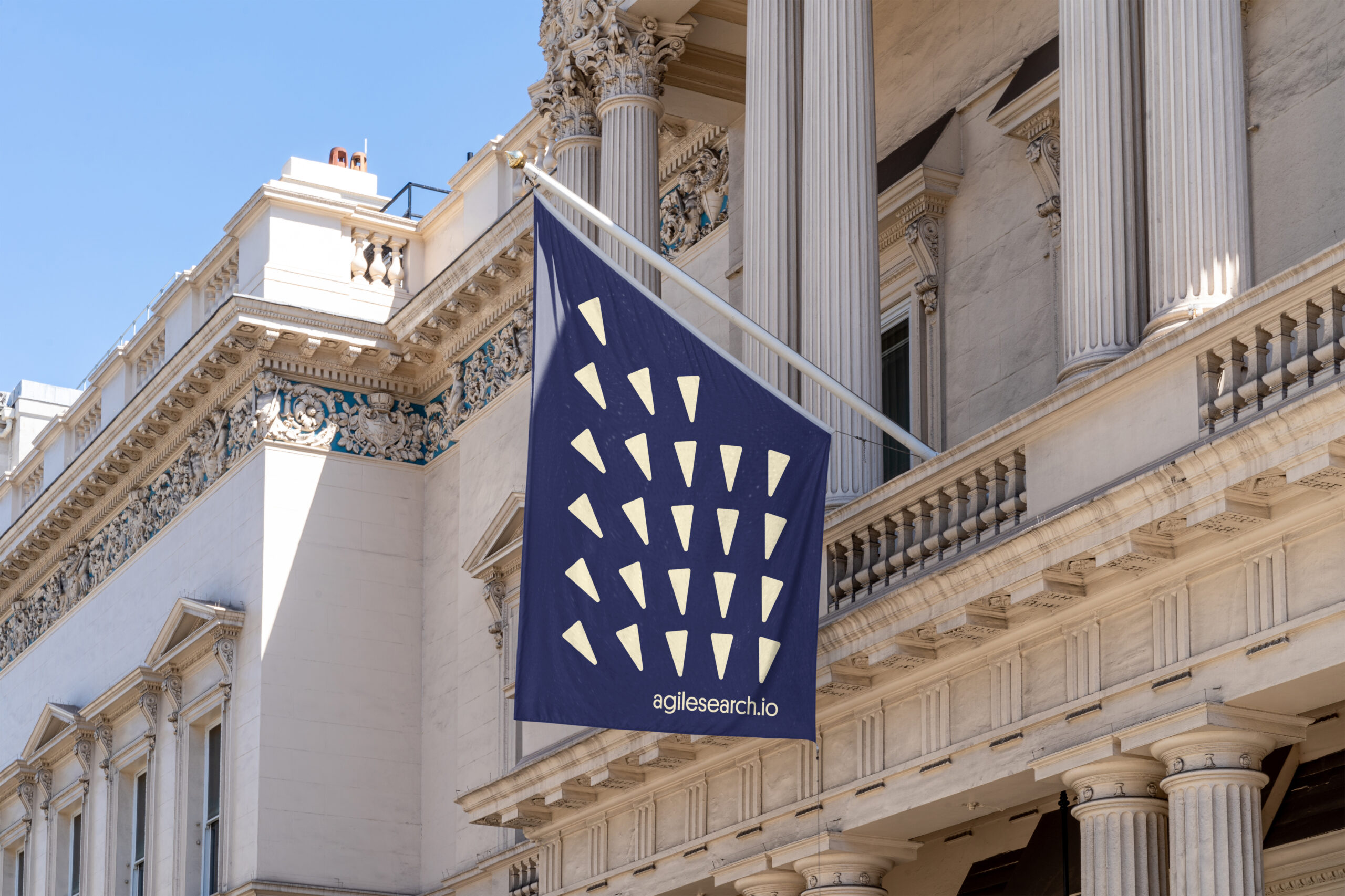
Agile Search_Flag

Agile Search is a leading tech recruitment company. Proud of the diversity in their team, these guys are the aces when it comes to supporting both company growth and career development in the tech sector.

The challenge was to replace the generic assets they had, while maintaining brand recognition.

The concept we settled on is designed to showcase the camaraderie and diversity they are so proud of, while providing Agile Search with a visual language unique in its category. None of the competitors used illustration in their communications, so we decided to make use of that and have some fun putting pen to paper in the process.
Agile Search Logo Refresh brand design
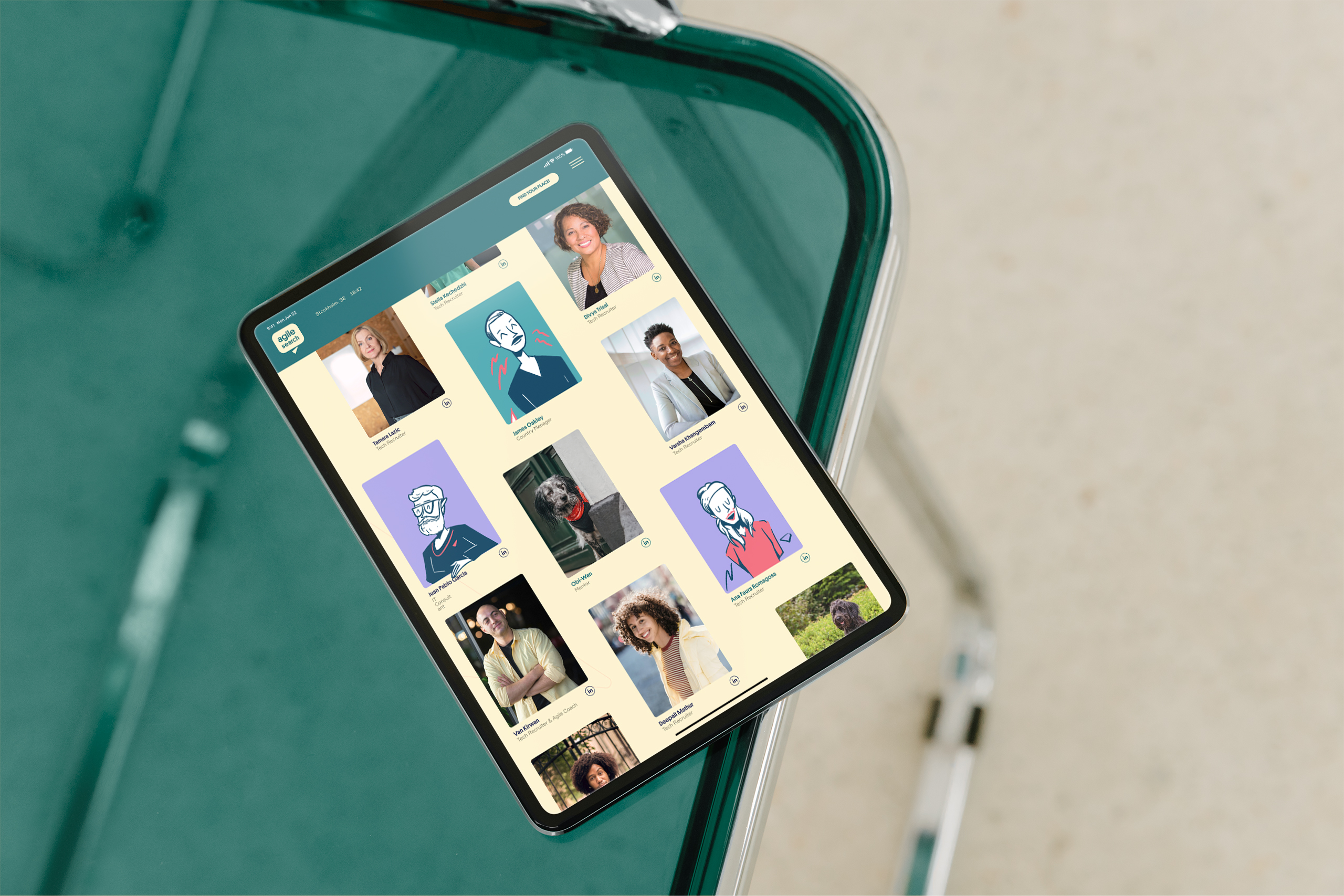
AS-ipad-cover-03-scaled- brand illustration
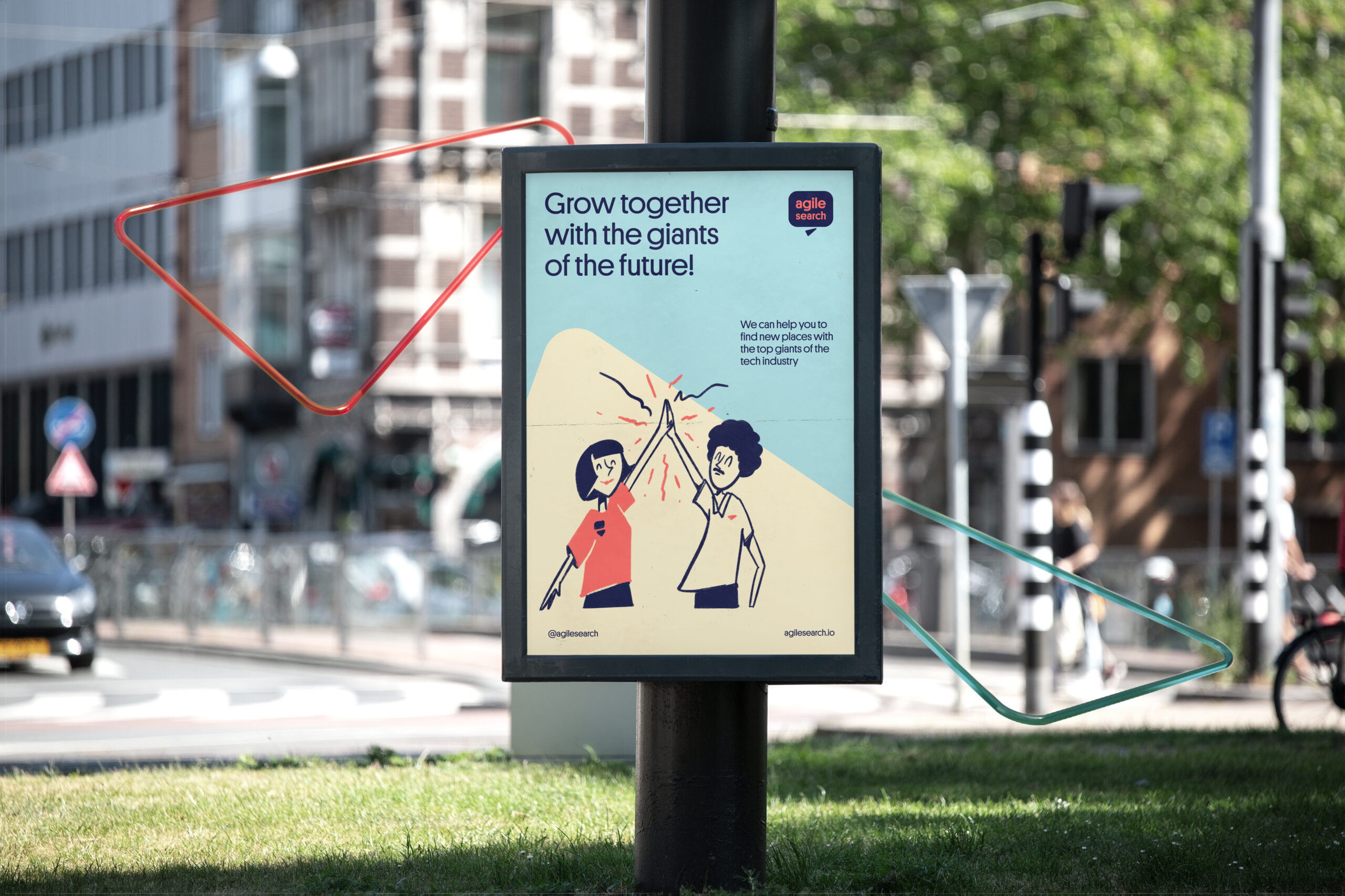
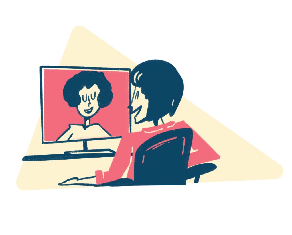
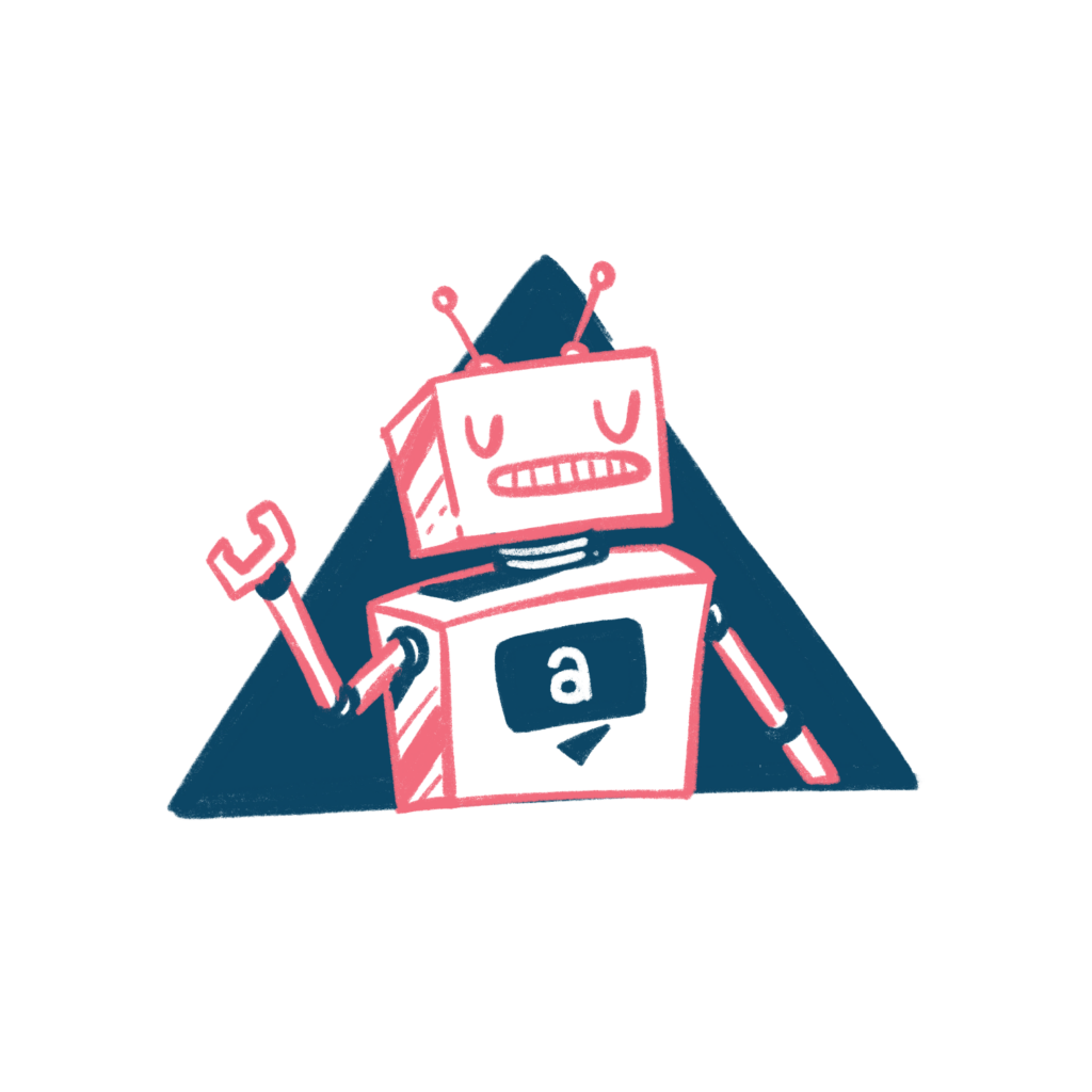
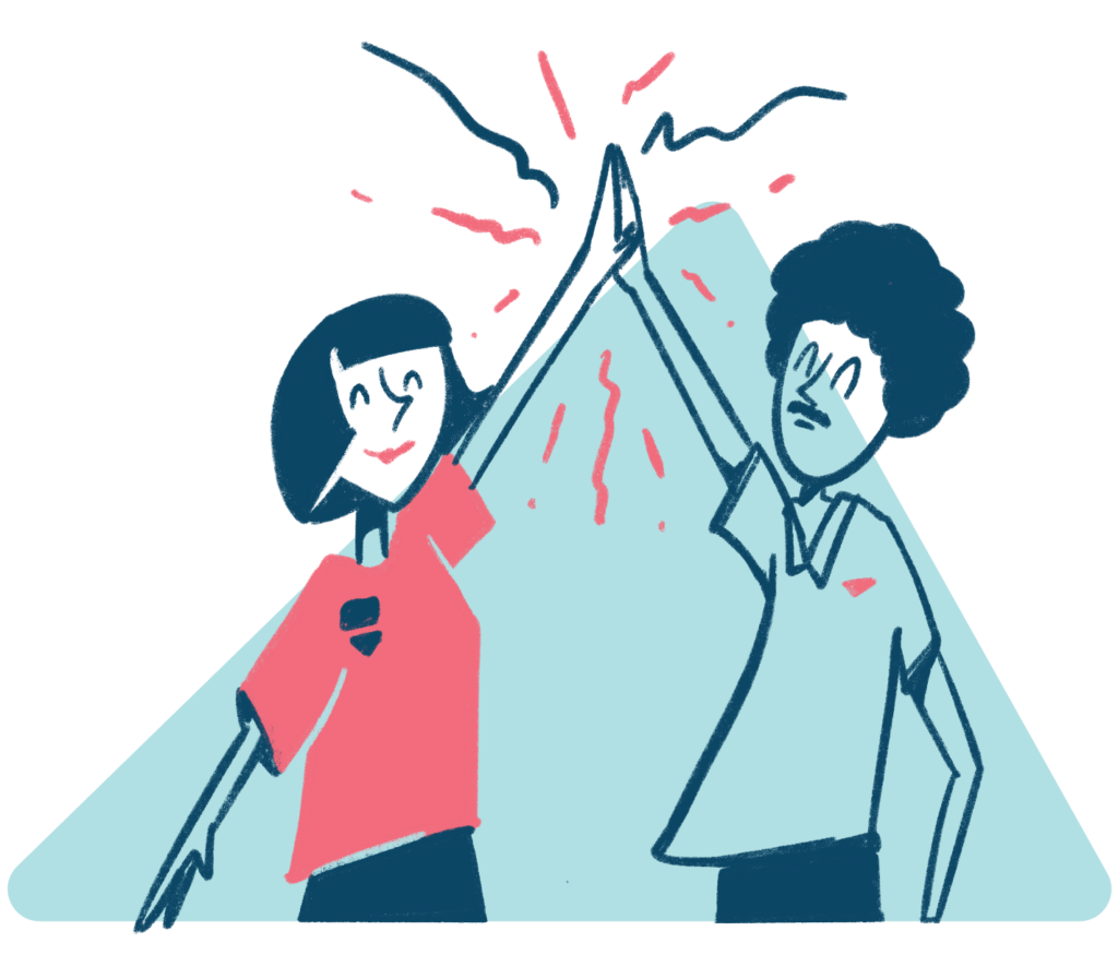
ech #recruitment with a heart is the basis of @agilesearch operations. To #differentiate the brand from competitors and integrate it's key mission of #DEI in the #brandlanguage, our art director @franko.ro created a set of wonderful hand-drawn #brandillustration to complement the brand refresh strategy. This was a big deviation from the IT and technology sector's usual style of vector-based cartoons as well. Our aim was for warm and organic looking sketches, inspired by 60's cartoons like the Jetsons and the Flintstones. By focusing on tiny but important details like simplified eye and hand shapes we could infuse an organic representation of racial diversity while continuing to build on an overall joyful brand impression. Taking the illustrative style a step further, a triangular grid backdrop to frame the sketches was created, drawing from the logo's arrow motif. This little detail added greater dynamism to the illustration grid while subtly reinforcing the brand language. The final result was a quirky and warm set of illustrations that perfectly complemented the @agilesearch brand.

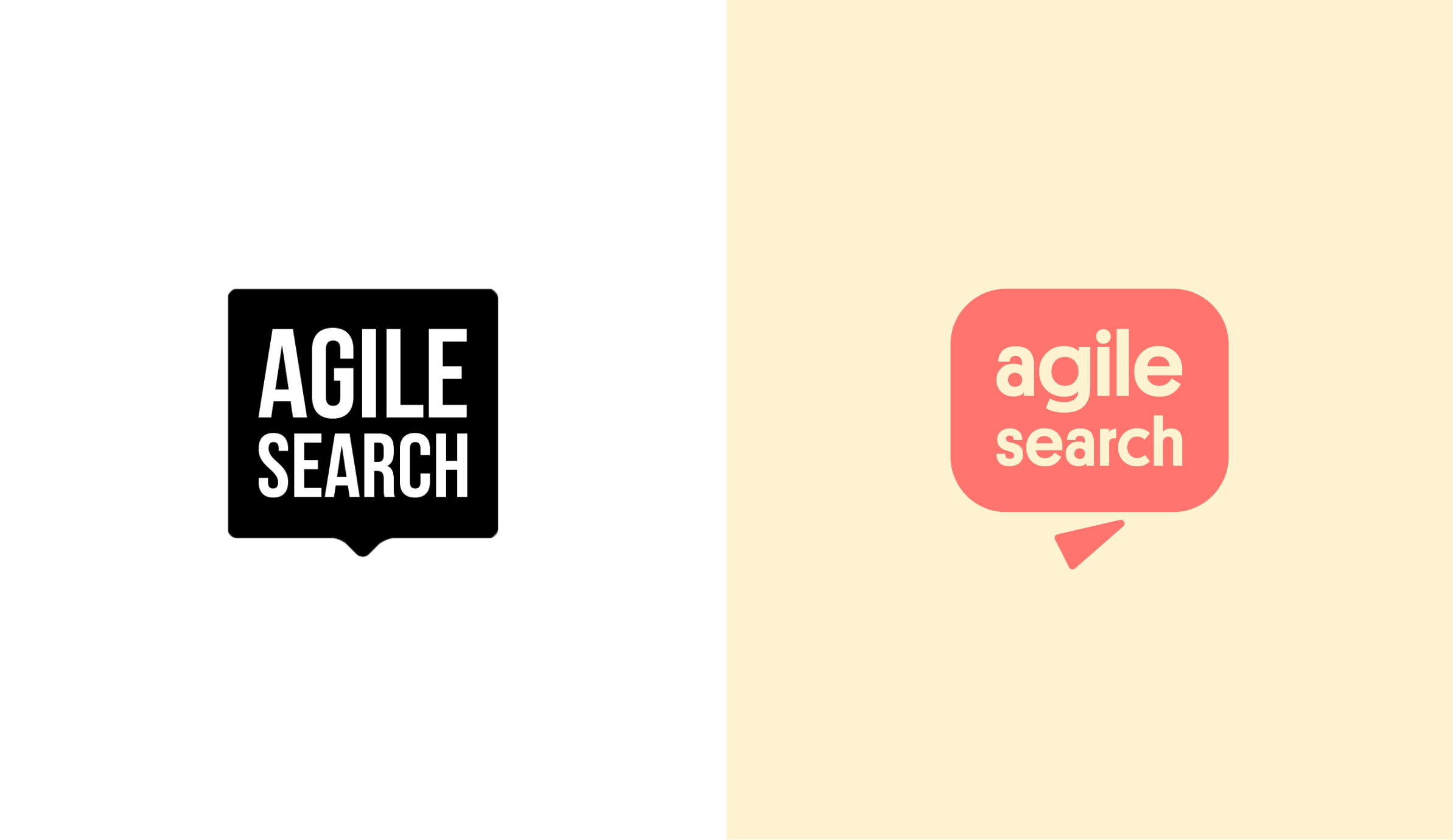
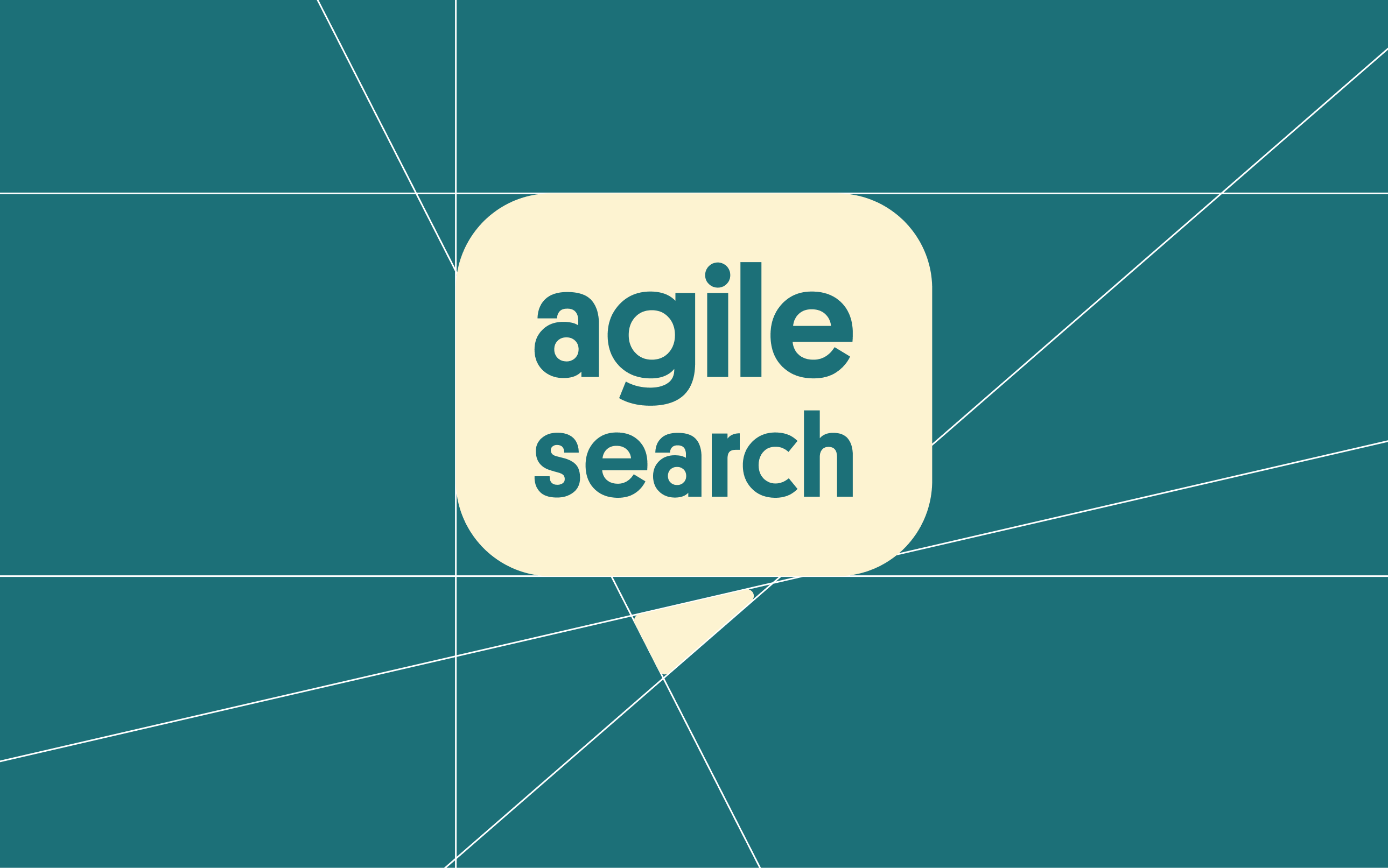
The original logo was an all-caps speech bubble in monochrome: it looked too stiff for an ‘agile’ brand and too stern for the company’s friendly vibe. The speech bubble itself looked conceptually incompatible with the site’s search function.

Our task was clear: improve emblem functionality while authentically represent agilesearch friendly personality in one go.
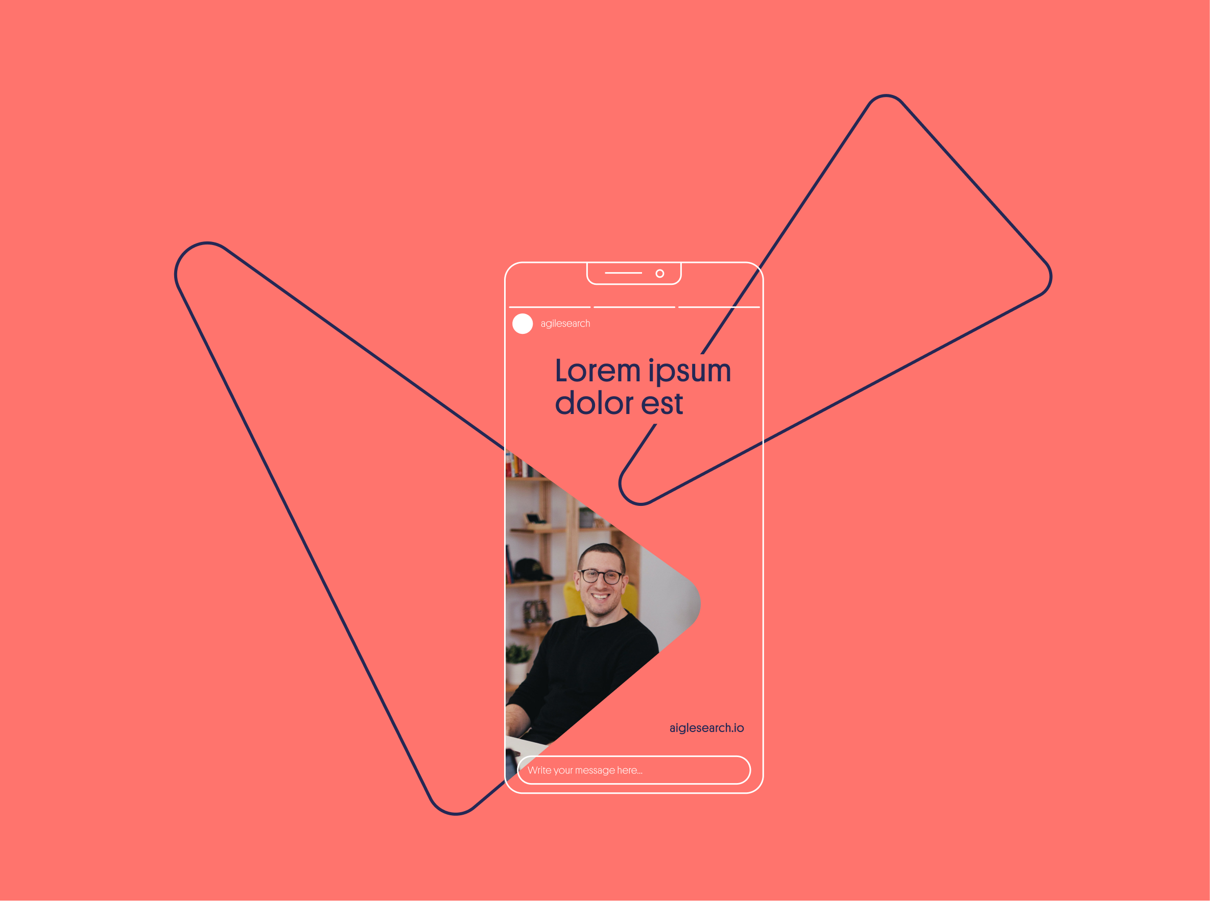
Separating the notch from the original bubble and repurposing it as a cursor/arrow for the site gave us big impact through minor change. Rounded edges, an asymmetrical font, and informal lowercase made for an instantly friendlier emblem. The final logo had much better relevance for the brand language, while also looking warmer and happier.
TECH

RECRUITMENT

WITH A HEART.

Digital Platform
To differentiate the brand from competitors and integrate it’s key mission of DEI in the brand language. We created a set of wonderful hand-drawn #brandillustration to complement the brand refresh strategy. This was a big deviation from the IT and technology sector’s usual style of vector-based cartoons as well.

Our aim was for warm and organic looking sketches, inspired by 60’s cartoons like the Jetsons and the Flintstones. By focusing on tiny but important details like simplified eye and hand shapes we could infuse an organic representation of racial diversity while continuing to build on an overall joyful brand impression.
Taking the illustrative style a step further, a triangular grid backdrop to frame the sketches was created, drawing from the logo’s arrow motif. This little detail added greater dynamism to the illustration grid while subtly reinforcing the brand language.

The final result was a quirky and warm set of illustrations that perfectly complemented the Agile Search brand.